
.com Forum · Banner Making Forum
Replies in this thread : 4
| Author | Topic : Critique? + Free Banner? | |||
| ruthlessHavoc Premium Member Posts : 21 |
hello!
Just dropping by for some constructive criticism on my first banner attempt since '04. I'm not very creative, so I'm thrilled to have at least ended up with the theme and color scheme I wanted. It definitely didn't start out that way and I almost gave up halfway through! I'm more accustomed to drawing dogs, but if I can get the hang of this, I'd like to get into banner making as well (so maybe I can fit in a little better with the crowd on showdog)  I'm not easily offended by criticism and would love to hear what you think I should improve on or continue doing in my next banner. 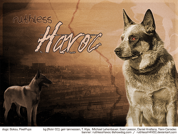 If you'd like to apply for a custom banner, fill out the form below! Anddd maybe offer some critique? I will probably only end up doing one (NOT first come first serve), but who knows. This will be totally free since I cannot predict the outcome. But I accept donations if you really really like it  haha hahaFORM Kennel Name: Secondary Text?: Breed (max 2?): Theme/Background: Colors: Text Style: Anything Else?: ----------- Critique?: Pricing Suggestion?: Thanks! -- havoc |
|||
| Laffy-Taffy Kennels Basic User Posts : 3,000+ |
I really love the theme! Only thing I don't like, is that the dog on the right is oversharp...but other than that I think it's cool and I need one, hehe... Kennel Name: Azzurro Secondary Text?: Our ribbons are always blue. Breed (max 2?): Australian Shepherd Theme/Background: I don't really have a theme yet, so you have pretty much free reign (but, I do like natural scenes) Colors: blues! (My favorite shades are Azure, Bleu de France, Dodger Blue, Sapphire, True Blue and Periwinkle, if that helps) Text Style: Classic and elegant Anything Else?: Nope! Thanks Alexandria |
|||
| ruthlessHavoc Premium Member Posts : 21 |
hm you're right, I see what you mean. I mostly sharpened the face to draw attention to it. I don't think I touched the rest of the dog very much, but I probably didn't need to at all since roan is a very contrasty color anyway. Thank you for your feedback! I don't know if it's obvious, but there's a definite theme for this one. Not sure if it's what you were looking for, but I had fun and I hope you like it!  |
|||
| Laffy-Taffy Kennels Basic User Posts : 3,000+ |
this post has been edited 1 time(s) Oooooh, it's beautiful! Are you positive you don't want a donation? And the theme could be obvious and I either missed it or didn't like it, haha. And about oversharpening, I did that recently with a wire-haired wildboar Dachshund GP, so I understand how easy it is to do! Thanks again! Alexandria ----- Last edited by Laffy-Taffy Kennels on 6/28/2014 6:12:58 PM |
|||
| ruthlessHavoc Premium Member Posts : 21 |
yes I'm sure, this one's on me. I'm so used to sharpening my art that anything not sharpened looks a little blurry to me haha. It's a bad habit now. |
|
Replies in this thread : 4 Post Reply |