
.com Forum · Banner Making Forum
Replies in this thread : 1
| Author | Topic : Quest For Improvement | |||
| ruthlessHavoc Premium Member Posts : 21 |
this post has been edited 1 time(s) hello! I'm hoping to get some constructive critique on some new banners I made. They are both for my own kennels, so tear them apart, I won't mind.
What do you like about my banners? What do you dislike? Why? How can I make it better? etc. Feel free to post your own banners here as well if you're also looking for critique  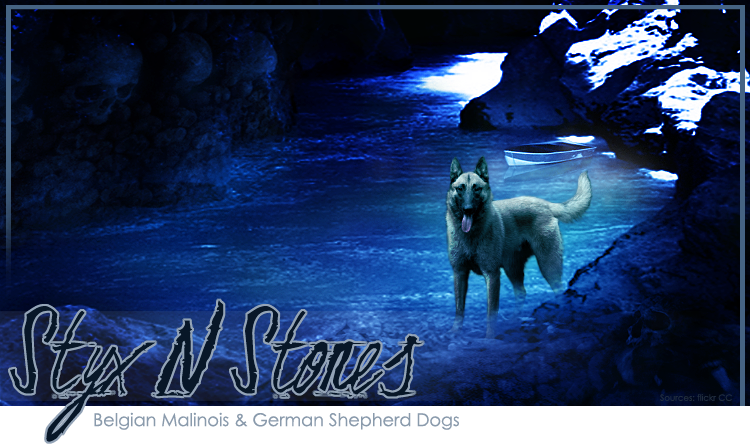   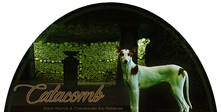 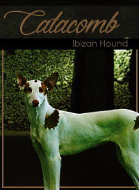 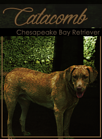 Thank you! ----- Last edited by ruthlessHavoc on 9/7/2014 6:46:19 PM |
|||
| Dreisaiah Hundehutte Premium Member Posts : 4,000+ |
The first one... The angle of the photo of the dog and the angle of the photo of the river are different. The line of the dog's back should be going "up" as well. If this were a real picture, the dog would be lacking some length in the rear legs which would bring down the topline. Essentially, he would have a very sloped topline, but he doesn't. I also wish he was colored blue like the rest. I can see that you added green to the backround of the dog to make it look like maybe a green spotlight or green lighting, but in reality, there would be that rich cerulean blue reflecting onto the dog and tinging him with that color as well. What I do like about the banner is the placement of the dog and the actual cropping of the dog was done well. I like that i can see the lower legs, but I think I can see a slight silhouette of the left front foot inside of the rock in the foreground, which makes no sense. (: The font is alright but a little dull compared to the rich blue and high contrast of the river edge. I think you got away with the detail of the font because of the relative simplicity of the background, and the font type goes well with the "Styx" word. I would have liked to seen perhaps a white text with a black outline, or vice versa, or perhaps bringing in some of that green from the dog. The frame confuses me slightly but I love that your credits are faded in the corner but still readable. I'm unsure if you meant this, but I enjoy what looks like a skull in the top left corner! Second... The semicircle banners are pretty fun aren't they? They are unique to the more popular rectangular banner. I like how you made the dog green to go along with the background; however, the background is slightly plain and actually "boring", and it is hard to see what it exactly is at first. I literally just realized what it is. BUT, the colors go well together. The top third portion approximately, is basically a lot of empty space. You could have cropped the background so that there was less empty space above, or placed a catacomb onto another background, added a black to transparent gradient behind the dog for the text to go on top of. The text is well placed in my opinion but the subtext should have been directly beneath the main text for balance. The text font is alright but maybe something Egyptian or ancient could have worked better than a classy script for an otherwise spooky or mysterious banner. The dog is the Chessie GP is at an awkward angle that is not complimentary to the conformation of the dog. I'm sure it's a nice dog but you can't really tell. Part of making a great banner is using great photos so the whole thing ties together and looks great. Overall your cropping and understanding of placement is very good, as well as color balance. I believe you are far into your quest for improvement. Just remember balance, softness of strength and strength of softness when needed, nothing over the top, and places for the eye to go and places for the eye to rest. An overly busy banner is immediately displeasing as well as an overly unbusy banner. They have the same effect. In my experience, the most pleasing banners have been those with beauty everywhere within the banner, but not necessarily an actual object. That's why I like to do landscape banners. |
|
Replies in this thread : 1 Post Reply |